
How to force the light or dark theme on Ionic


When I created my last app, "daily baby care" (an app for my wife and I, to track our 3 months infant meals & naps), I wanted to add a button in the app to force the light/dark theme.
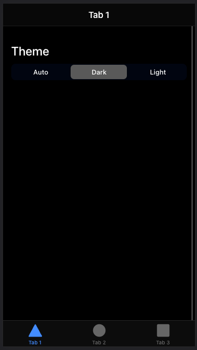
Something like this:
So how would it work? Well, by default, an Ionic app will use the media queries to know when to use the dark mode:
:root {
    --ion-color-primary: #3880ff;
    //[...]
}

@media (prefers-color-scheme: dark) {
    // here's the dark theme override
    body {
//[...]So I searched for an easy way to force it in the app. (BTW it's super easy to force it in Chrome for your tests)
But I could not find any. It seems impossible to force the prefers-color-scheme in the app without having to change the scss files.
So I started searching for an easy solution, but then it hit me: just take control of how it works.
What do I really want? I want :
- auto mode by default
- to be able to force it in dark mode
- to be able to force it in light mode
The default code of an Ionic app makes it impossible to "force" it in dark. So I have to change the logic here.
My idea was to add 3 new possible classes on the root body of the app.
- If the body has the class auto, it will use the light theme or the dark theme (if prefers-color-scheme: dark).
- If the body has the dark class, it will use the dark theme
- If the body has the light class, it will use the light theme
How to do that? Simple, just a few steps.
First, I'll split my scss files into 4 files :
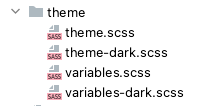
The variables.scss will contain the default light theme:
:root {
  --ion-color-primary: #3880ff;
  --ion-color-primary-rgb: 56, 128, 255;
  --ion-color-primary-contrast: #ffffff;
  --ion-color-primary-contrast-rgb: 255, 255, 255;
  --ion-color-primary-shade: #3171e0;
  --ion-color-primary-tint: #4c8dff;

  // [...]
}
Then, in my variables-dark.scss, I'll create some mixins to contain the default dark theme variables:
@mixin dark-theme() {
  --ion-color-primary: #77c6bf;
  // [...]
  --ion-color-light-tint: #474747;
}

@mixin dark-ios-body() {
  --ion-background-color: #000000;
  // [...]
  --ion-color-step-950: #f2f2f2;
  --ion-item-background: #000000;
  --ion-card-background: #1c1c1d;
}

@mixin dark-ios-modal() {
  --ion-background-color: var(--ion-color-step-100);
  --ion-toolbar-background: var(--ion-color-step-150);
  --ion-toolbar-border-color: var(--ion-color-step-250);
}

@mixin dark-android-body {
  --ion-background-color: #121212;
  // [...]
  --ion-color-step-950: #f3f3f3;
  --ion-item-background: #1e1e1e;
  --ion-toolbar-background: #1f1f1f;
  --ion-tab-bar-background: #1f1f1f;
  --ion-card-background: #1e1e1e;
}
Now, I want to @include those mixins in 2 situations :
- when there is the dark class on the body of the app
- when there is the auto class on the body of the app AND the prefers-color-scheme: dark
To do that, I'll use those mixins in my theme-dark.scss file:
@import "variables-dark";

body.dark {
  @include dark-theme();
}

.ios body.dark {
  @include dark-ios-body();
}

.ios body.dark ion-modal {
  @include dark-ios-modal();
}

.md body.dark {
  @include dark-android-body();
}

@media (prefers-color-scheme: dark) {
  body.auto {
    @include dark-theme();
  }

  .ios body.auto {
    @include dark-ios-body();
  }

  .ios body.auto ion-modal {
    @include dark-ios-modal();
  }

  .md body.auto {
    @include dark-android-body();
  }
}
As you can see, if the body has the dark class, I'll @include my dark mixins.
Or, if the prefers-color-scheme: dark AND the body has the class auto, I'll include my dark mixins.
Seems like a smart solution right? Now I just have to change the class on my body.
BTW, don't forget to add your new scss files to your project file:
"styles": [
    "src/theme/variables.scss",
    "src/theme/variables-dark.scss",
    "src/theme/theme.scss",
    "src/theme/theme-dark.scss",
"src/global.scss"],So, to add the class to my body, I'll create a ColorSchemeService that will add/remove the wanted classes onto the body, by using @Inject(DOCUMENT) :
import { Inject, Injectable } from '@angular/core';
import { DOCUMENT } from '@angular/common';

@Injectable({
  providedIn: 'root',
})
export class ColorSchemeService {
  constructor(@Inject(DOCUMENT) private document: Document) {}

  getColorScheme(): string {
    return localStorage.getItem('colorScheme') ?? 'auto';
  }

  setColorScheme(newColorScheme: string): void {
    localStorage.setItem('colorScheme', newColorScheme);
    this.loadStoredTheme();
  }

  loadStoredTheme(): void {
    const colorScheme = localStorage.getItem('colorScheme');
    if (!colorScheme) {
        return;
    }
    this.document.body.classList.remove('auto');
    this.document.body.classList.remove('dark');
    this.document.body.classList.remove('light');
    this.document.body.classList.add(colorScheme);
  }
}
Of course it could be better to use an ENUM for the color schemes, and avoid to store it in the localStorage, but, hey, what you gonna do :)
Finally, I just have to use that service when the app loads:
import { Component, Renderer2 } from '@angular/core';
import { ColorSchemeService } from './services/color-scheme.service';

@Component({
  selector: 'z4e-root',
  templateUrl: 'app.component.html',
  styleUrls: ['app.component.scss'],
})
export class AppComponent {
  constructor(private readonly colorSchemeService: ColorSchemeService) {
    this.colorSchemeService.loadStoredTheme();
  }
}
And when I click on one of my buttons:
 <ion-segment color="primary" [(ngModel)]="colorScheme" (ionChange)="colorSchemeChanged()">
    <ion-segment-button value="auto">
      <ion-label>Auto</ion-label>
    </ion-segment-button>
...colorScheme: string;
constructor(private readonly colorSchemeService: ColorSchemeService) {
this.colorScheme = this.colorSchemeService.getColorScheme();
}
colorSchemeChanged() {
this.colorSchemeService.setColorScheme(this.colorScheme);
}And... it works!
Just a tiny little last thing, by default, the light theme doesn't declare it's color and background-color. That's why I added the theme.scss file, to define them and avoid some weird backgrounds in forced modes:
body.light {
  color: var(--ion-text-color);
  background: var(--ion-background-color);
}
You can find the source code here: https://github.com/HowTommy/ionic-force-color-schemes
Hope that was helpful,
Have a good night!